In 1913, Vladimir Tatlin wanted to create a form of art that present the social issues that Russia was facing such as the Revolution. The art movement was architectural as well as artistic, and it was called the Constructivism art. The artists designed posters. They created modern art. They used a lot of the colours red, white and black, and they had a lot of geometric shapes. They also use a lot of Sans Serif typeface and bold font. A lot of the text is slanted at angles. Some posters were made for films. In my opinion, the constructivists art was a powerful, as it was modern, quite persuading and artistic. Which means that it appeals to a wide range of audiences. Personally, I generally don't like primary colours, like bold red and geometric shapes. I prefer surreal art, usually of people and human body parts, like a hand, because I believe that it makes the audience relate in a sense, but mostly, I like the look of it. Additionally, I prefer secondary colours. I don't despise it, but I have my preferences. However, I think that bright, primary colours like red, and geometric shapes stand out because they're bold and typically not complex.
 |
| Gustav Klutsis designed this in 1930. A Soviet agitational propaganda poster, to get workers to vote. |
 |
| Made in the 1920's for a Stenberg Brothers film. It's a Soviet poster. The designer is |
 |
| A propaganda poster designed in 1919, by El Lissitzky. |
Inspiration from Constructivists artists
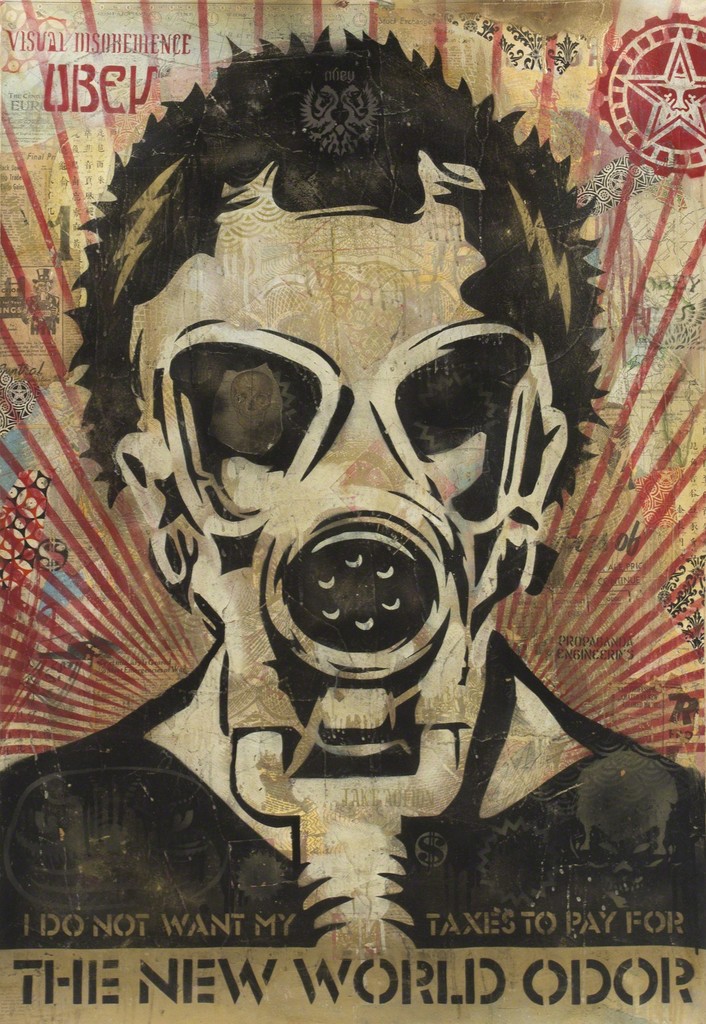 |
| This was designed in 2005 by Sheperds Fairey |
My attempt
I made a design in Photoshop inspired by the Constructivist art movement, but I dislike it and I was planning to delete it and never share it. However, I think it's worth sharing, so I can make a better version and see the progress. Additionally, it is good practice.
I notice that they use a lot of geometric shapes, and the colours red, white and black. For this reason, I decided to make this, but incorporate a polar bear to make it an environment movement poster. It's landscape because it is inspired by the designs below. It's landscape due to example 1, and the triangular lines, the angle and the main object being placed in the middle, are inspired by example 2.
 |
| Example 2 |
 |
| Example 1 |


Comments
Post a Comment